I helped travelers shop with confidence by enhancing the Gebrüder Heinemann webshop’s accessibility, core user flows, and design consistency.
design system
information architecture
accessibility
figma
e-commerce
WCAG AA
Outcomes
By enhancing checkout and cart flows, refining the design system, and implementing WCAG AA standards, I created a more inclusive and scalable user journey.
In-depth breakdown
By mapping the current experience, I surfaced about a dozen friction points across navigation, product discovery, and checkout. I compared Heinemann’s setup to 8 direct competitors and filtered Baymard’s most relevant insights.
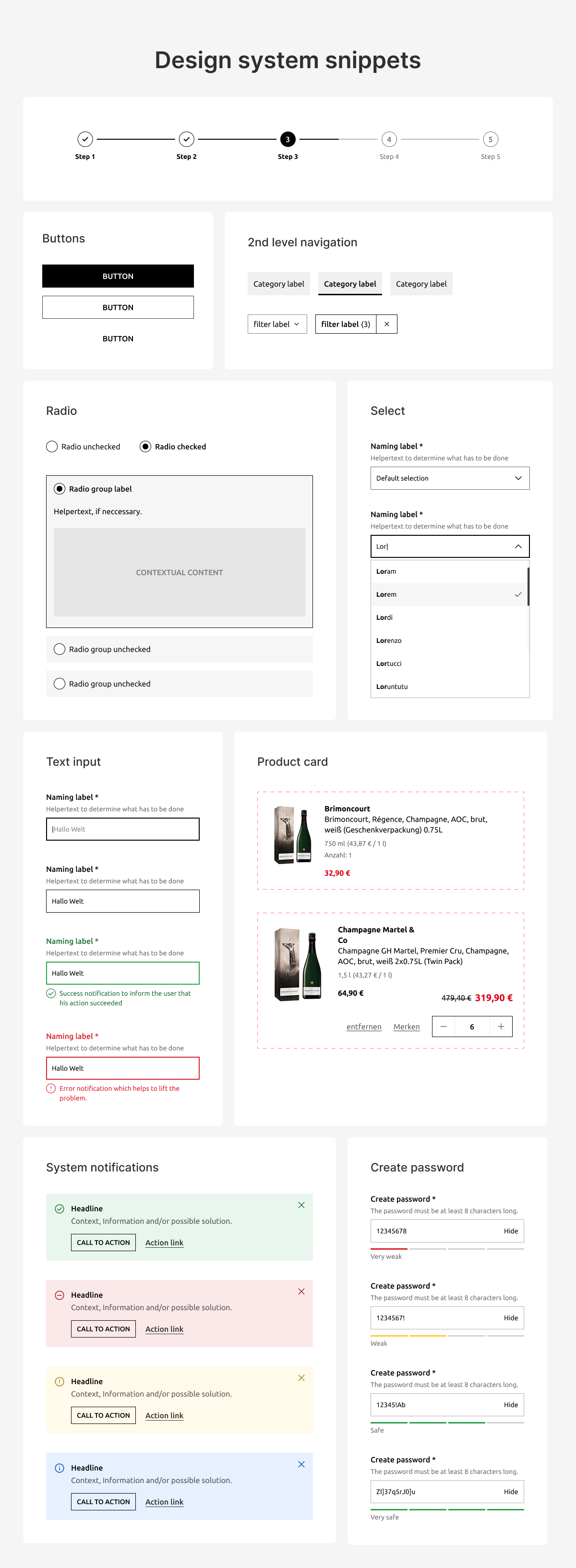
Backed by that data, I moved into wireframing and prototyping. Always building on and extending the brand’s existing design system.
1
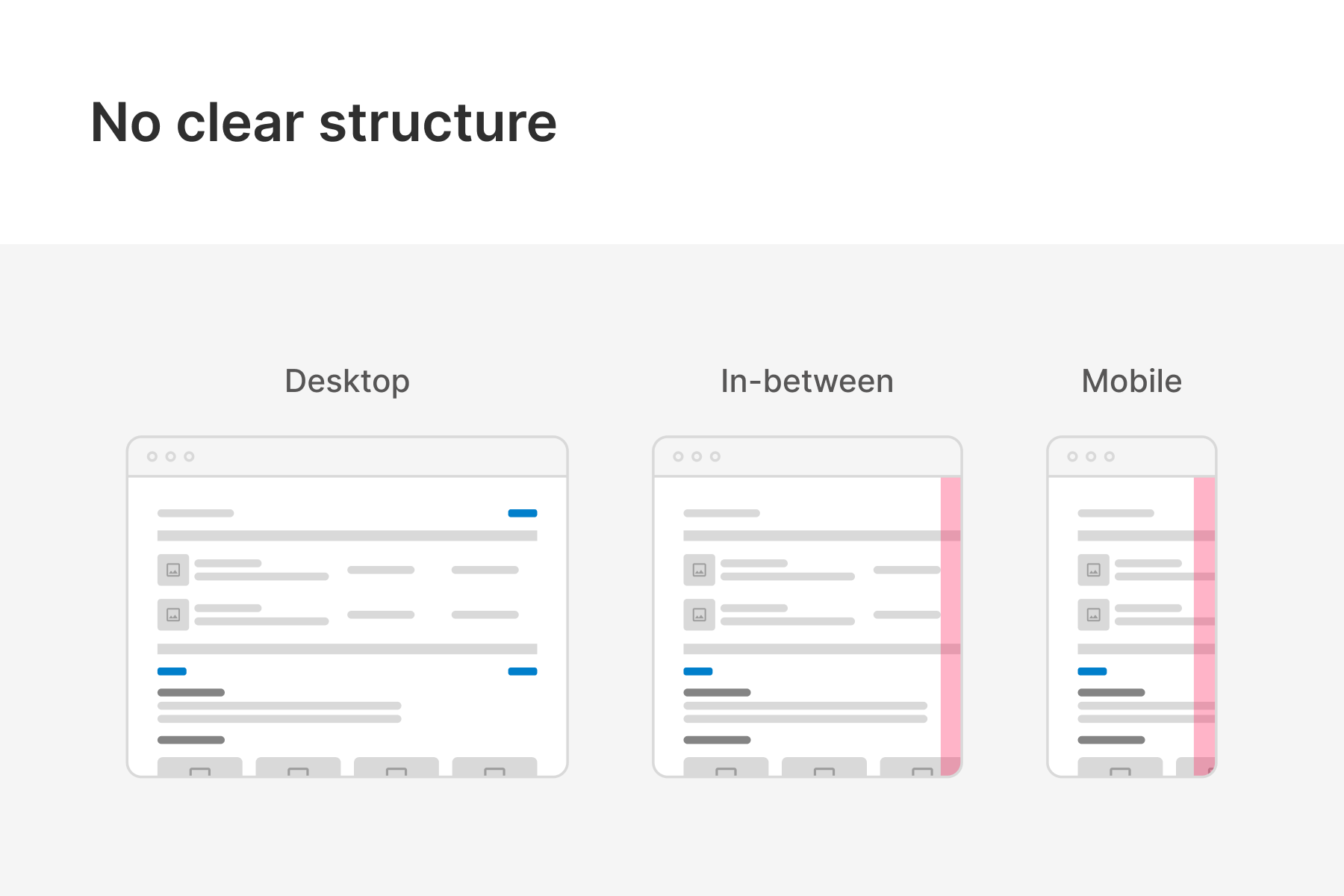
The problem
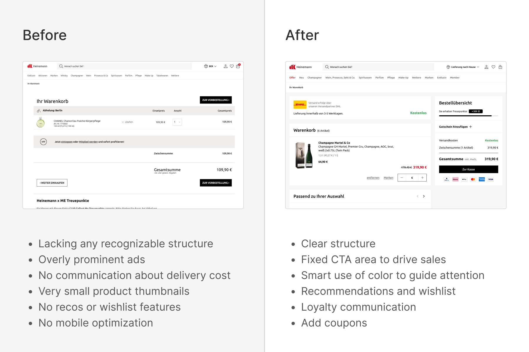
The cart lacked clear guidance and failed to deliver a smooth buying experience across devices. Right from the start of the funnel.
2
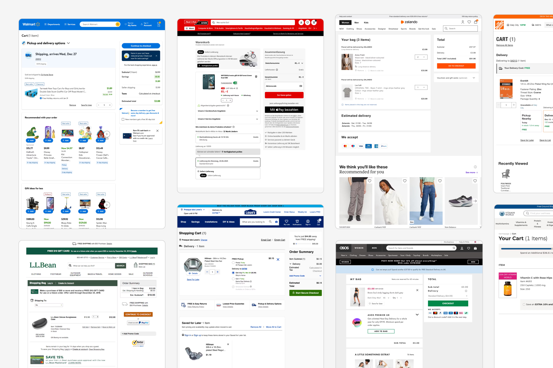
Benchmarking
What approaches are competitors using? By scanning them, I identified and curated key opportunities.
3
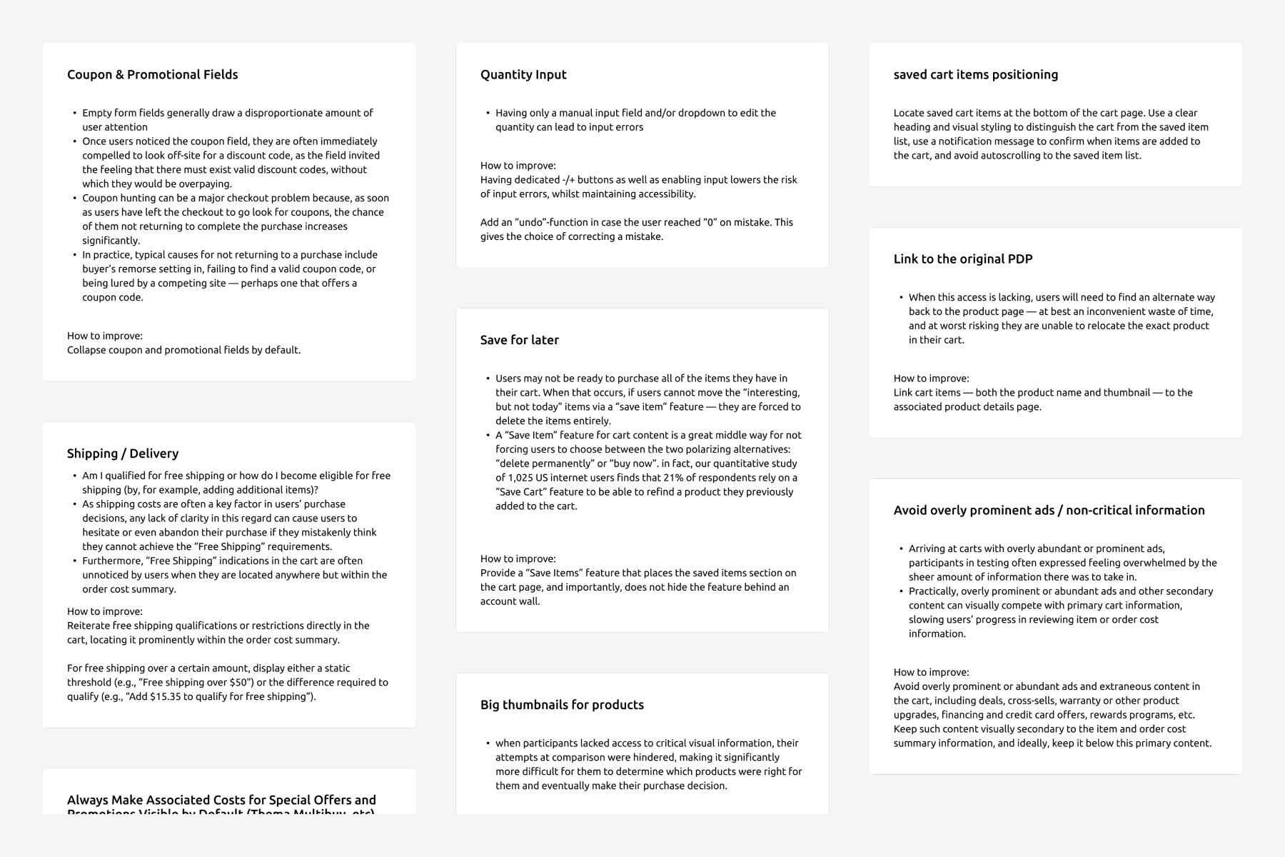
Baymard
Using Baymard’s audits, I curated evidence-based guidelines to strengthen and validate my design decisions.
4
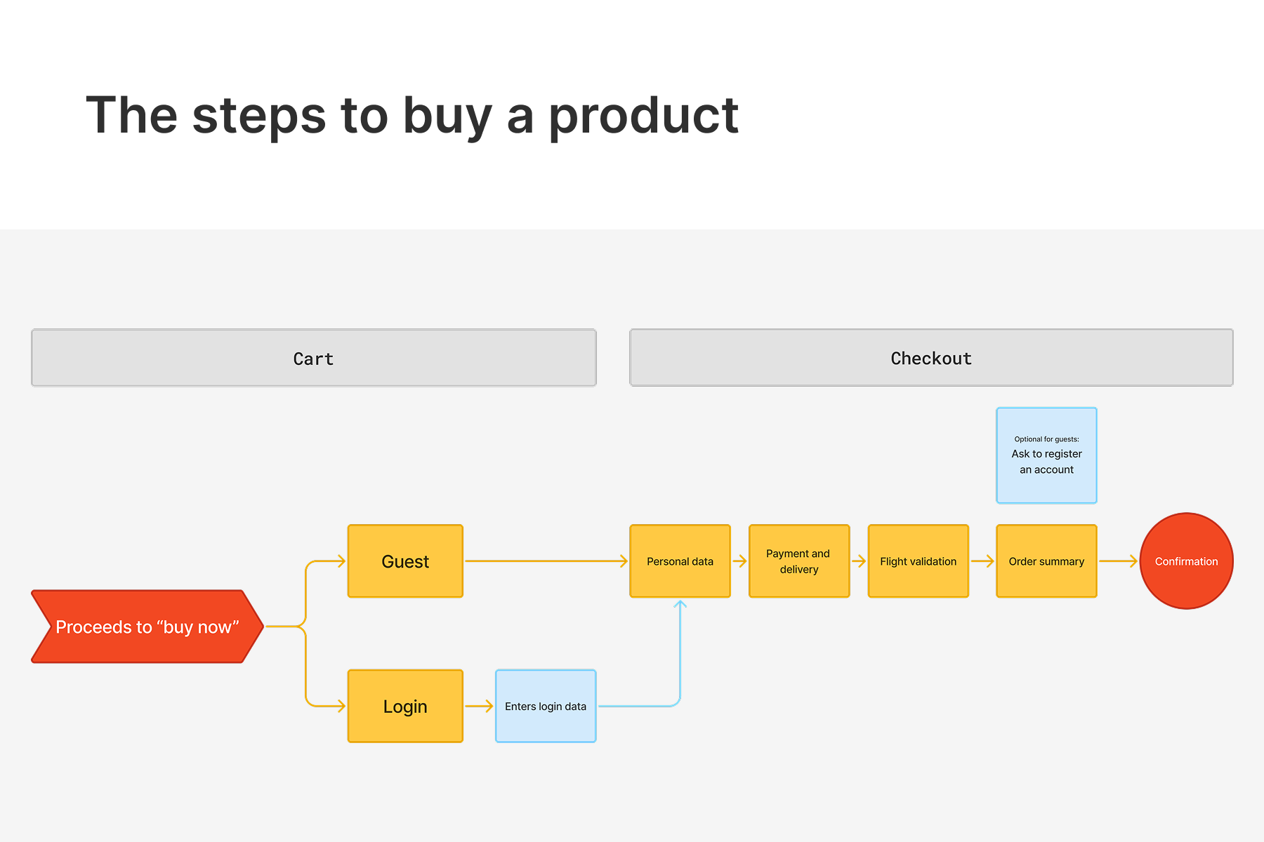
User journey
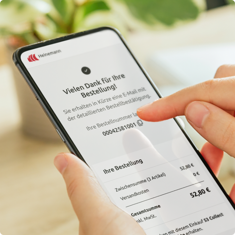
I redesigned the purchase flow for different user roles and added a final optional prompt to convert guests into registered users.
5
Comparison
The process resulted in a comprehensive, organized blueprint of every flow through to the final sale, making it easy to visualize the improvements in a clear before-and-after view.
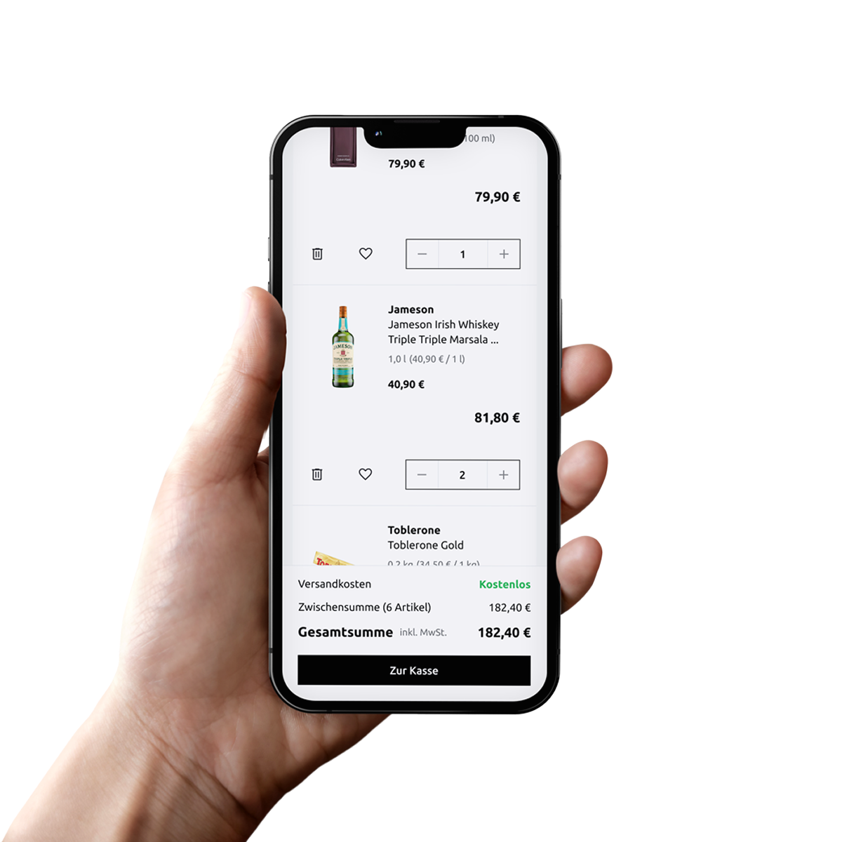
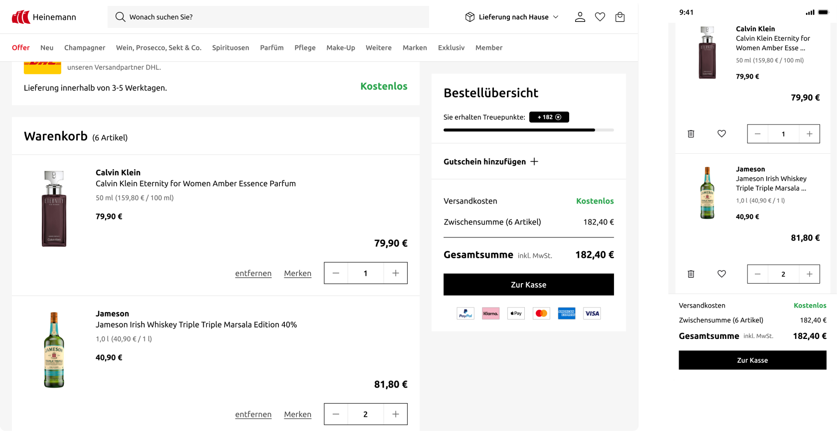
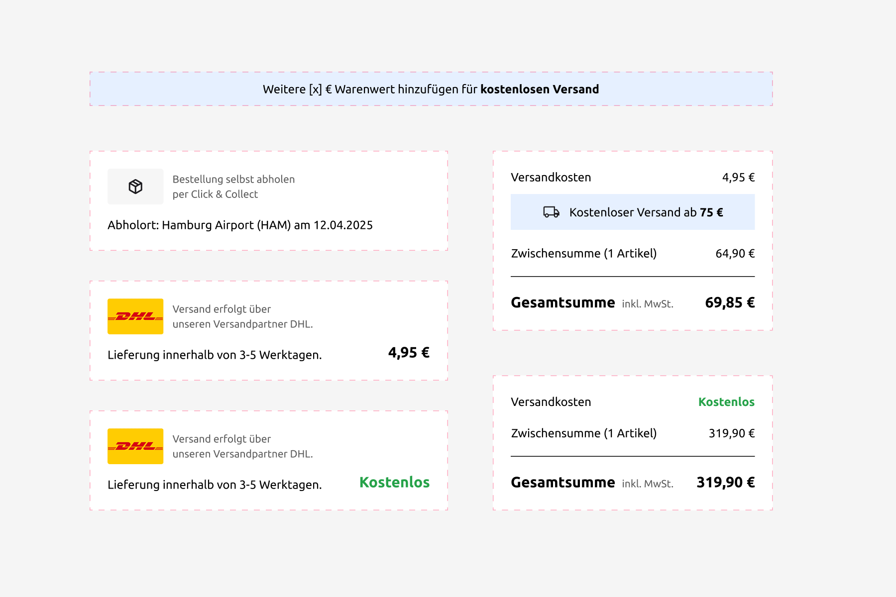
Fixed call to action
On desktop and “in-between”, I moved the CTA and all information related to the sale to a fixed position on the right side of the screen. On mobile a fixed price bar connects via anchor to the final call to action.
Delivery options
Am I qualified for free shipping or how do I become eligible for free shipping (by, for example, adding additional items)?
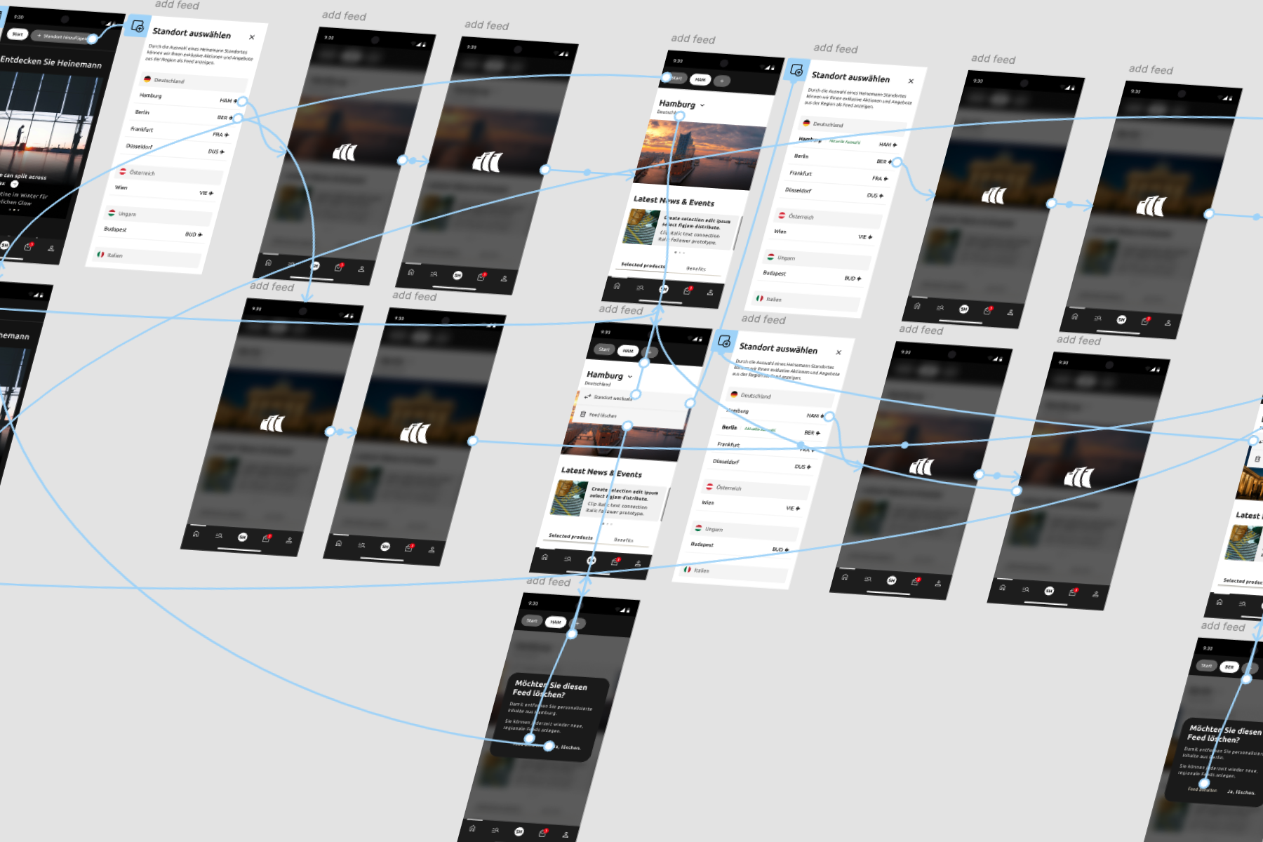
Prototyping
I created alot of prototypes. For example, to validate assumptions for a new “add feed” feature for the app. Through 2 rounds of user interviews, which I prepared, moderated and analyzed, I validated a user journey which went live in the app.
available for projects
If I’ve sparked your interest, feel free to reach out.